This area unfortunately garners quite a bit of negative press in regards to the amount of environmental destabilization that the oil sand mining is perceived to cause. Because of this, the Municipality constantly strives to improve its image through a variety of communications, in an effort to both combat the negative perceptions of the area as well as hope to draw more investors and workers to sustain the growth of the area.
The negative press often overrides the positive stories coming from the region that really showcase its community and great natural areas. One example of these efforts to further share the positive side of the region is the 2013-2014 Economic Profile that was created in both a web version (link below) as well as a physical, coffee table-style book.


The negative press often overrides the positive stories coming from the region that really showcase its community and great natural areas. One example of these efforts to further share the positive side of the region is the 2013-2014 Economic Profile that was created in both a web version (link below) as well as a physical, coffee table-style book.


Retreieved from: http://www.woodbuffalo.ab.ca/Doing-Business/Economic-Development/Economic-Profile-2013-2014.htm
The main purpose of the book is to provide "snapshots" of information for those who wish to develop in the area. However, looking through the book you can tell that the information is made accessible for anyone who wishes to learn more about the RMWB.
I think that the strong focus on design here is really important to consider. If an entity wants information to be conveyed to as many people as possible, it has to be accessible and easy to read. The statistics presented in this book could have easily been put into a formal report, however its fair to say that most people would not spend much time looking through it if it was all just numbers. By creating an attractive piece of communication, more time would be spent by readers, which allows for greater information sharing.
I think that the strong focus on design here is really important to consider. If an entity wants information to be conveyed to as many people as possible, it has to be accessible and easy to read. The statistics presented in this book could have easily been put into a formal report, however its fair to say that most people would not spend much time looking through it if it was all just numbers. By creating an attractive piece of communication, more time would be spent by readers, which allows for greater information sharing.
Do you think that graphics should be an important consideration for political communication?
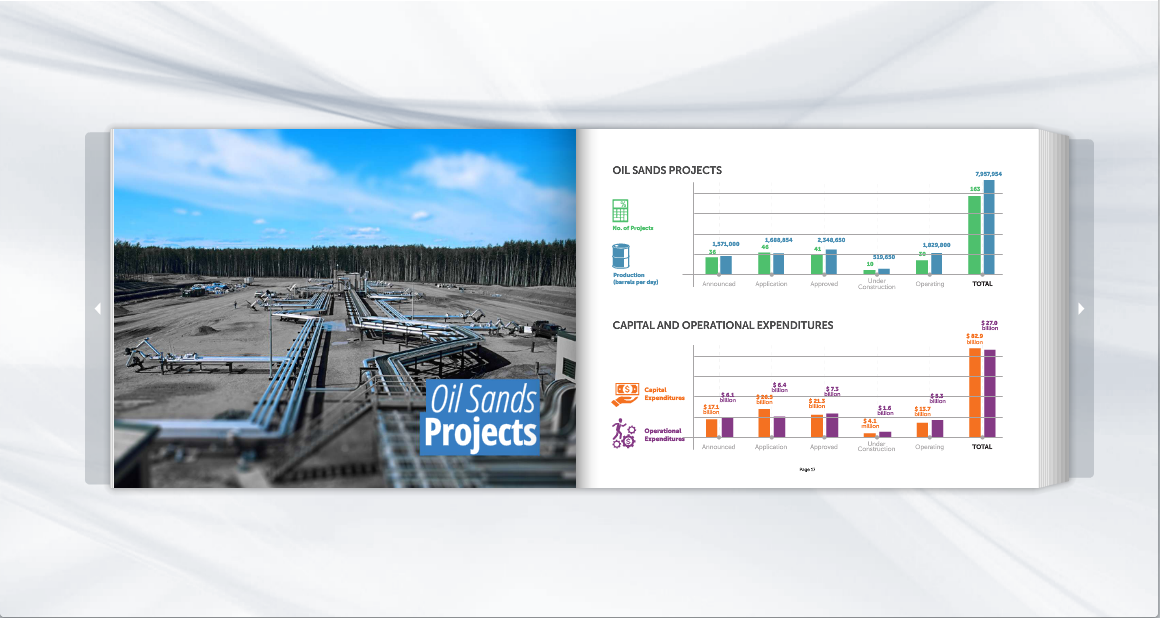
Some more pictures from the book, which can be found by clicking here:

A very pertinent point: there are certainly many scholars who argue that the image is the most effective way of communicating a message today, since we live in a screen age and are constantly bombarded by PR and advertising from every angle (e.g. Kevin DeLuca). The substance of the text itself is still important though.
ReplyDeleteThe language and images both effectively convey a sense of dynamism, but it is especially interesting to see how the language ('economic treasure', 'bold, innovative and growing') and the pictures (especially the bottom one) assert certain priorities over those of their environmental critics. To what extent is this providing (neutral) information to those with a commercial or passing interest, and to what extent an exercise in (persuasive) image management?